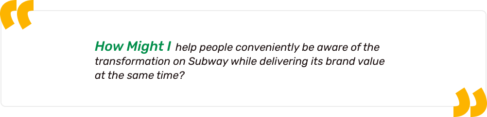
For Subway Users, I Effectively Highlighted The Value Of Subway Through Responsive Design.
Subway has recently revamped its brand image with a new set of ingredients, changed menu items and shining new slogan. However, these changes have flown under the radar for a lot of people and many are still unaware of the brand’s transformation. I redesigned a new responsive Subway landing page to make their website easier to navigate and more in tune with the disruption of their image.
To get up to speed on Subway, I researched about it and discovered some pain points Subway faces.
01. Desk Research
Current situation on Subway
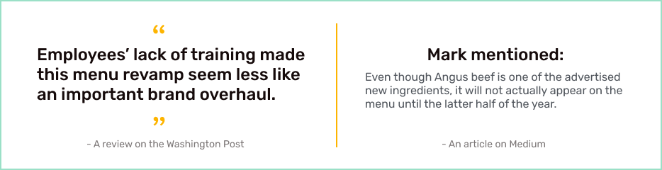
Subway has attempted to provide different looks, however, there are some obstacles; several don’t feel any changes and even staff still don’t know how to make the newly launched menu items which make people more confused of its alteration.
02. Website review
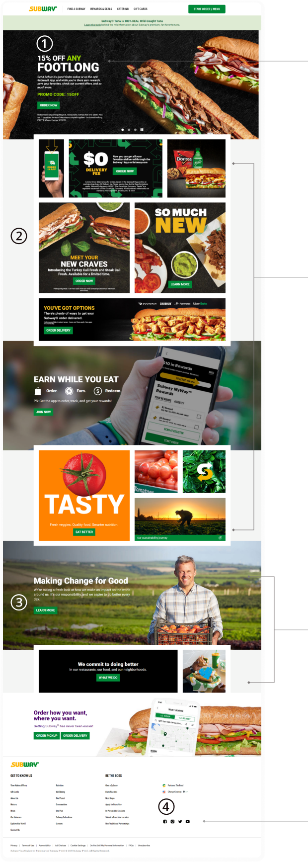
Current U.S Subway website & analysis
To properly understand Subway, I checked their website and found some parts that can be improved.
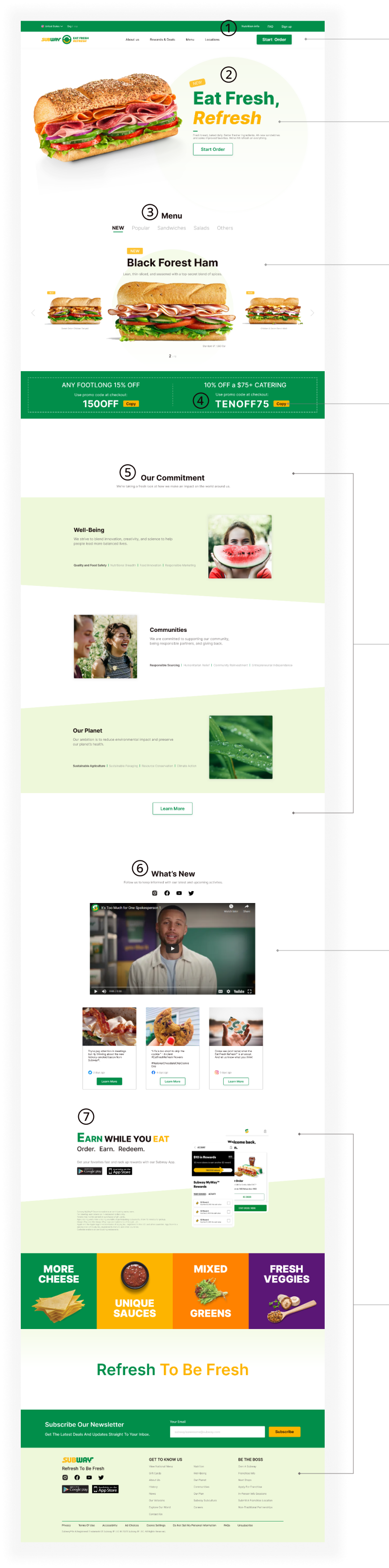
① No information for new change
Even though Subway changed many things but it is hard to see any changes in the website. By promoting the new updates on Subway, people can easily recognize the latest looks.
② Too many buttons & lacked of consistent
Too many buttons feel people confused and disorganized. It needs to be simpler and clearer to easily understand and click fast. At the same time, it needs to be written the same tones and words to give the uniformity.
③ Redundant information
The section shows the same information of the commitment of Subway. It needs to be shortened to reduce repeated information.
④ Less Accessible for social media
Many people interact on social media, but it is hard to find because it is located in the bottom of the website. It needs to be in a visual place to be more accessible.
The main goal according to the research was:
Subway needs to raise awareness about the new change and provide better impression to people.
Understanding people
I conducted a survey and impression testing to understand what perspectives people have for both casual food and Subway.
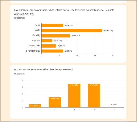
01. Survey
Participants
18
Fast food users
13
Early 20’s to mid 30’s females
5
Early 20’s to mid 30’s males
Key findings from the survey were:
People want to easily see the new and popular menus.
People usually get information from social media.
People tend to look for the promo and deals before making a purchase.
Many people care about the brand ethics and image which impact on the purchase of the foods.
People tend to choose casual food based on their preferences not what the review says.
After the survey on casual food, I did an impression testing which is the way to figure out what feelings people have on the brand providing some adjectives to choose that fits for Subway.
Participants
12
Subway enjoyers
7
Early 20’s to mid 30’s females
5
Early 20’s to mid 30’s males
Adjectives I used were:
Cheap / Expensive / Bright / Dark / Happy / Retro / Colorful / Old / Young / Delicious / Awful / Interesting / Blue / Fresh / Crispy / Big / Bold / Brave / small / board / casual / fancy / Dull / Traditional / Boring / Cheesy / Fun.
What I found on the testing was:
50 %
of people think Subway is FRESH and HAPPY
50 %
of people think Subway is INTERESTING and CASUAL
50 %
of people think Subway is YOUNG
The main goal according to the survey and the impression testing was:
Subway needs to effectively provide the brand beliefs and identity.
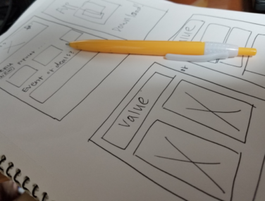
Sketches
With some ideas and suggestions, I sketched out and decided how to design the website.
01. Rough hand sketches
I tried to show its brand identity and prioritize the orders of the features that people want to see on the website according to the survey and impression testing.
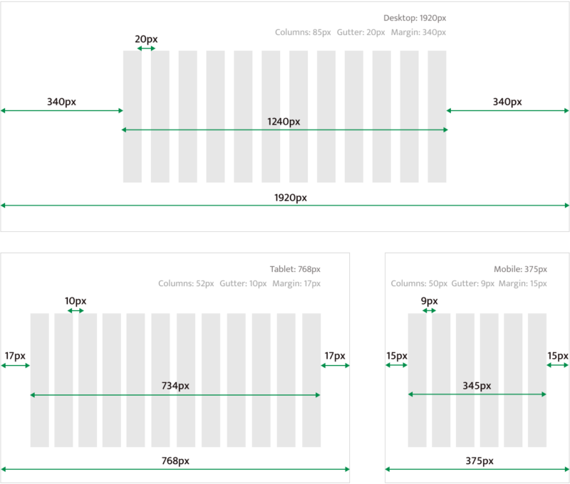
02. Grid system
I chose these grid system below to better responsive layout structure for text, images, and functions in a consistent way.
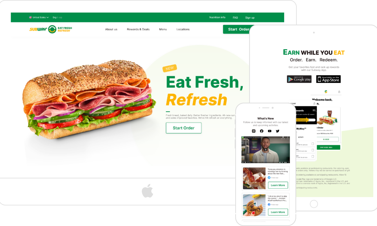
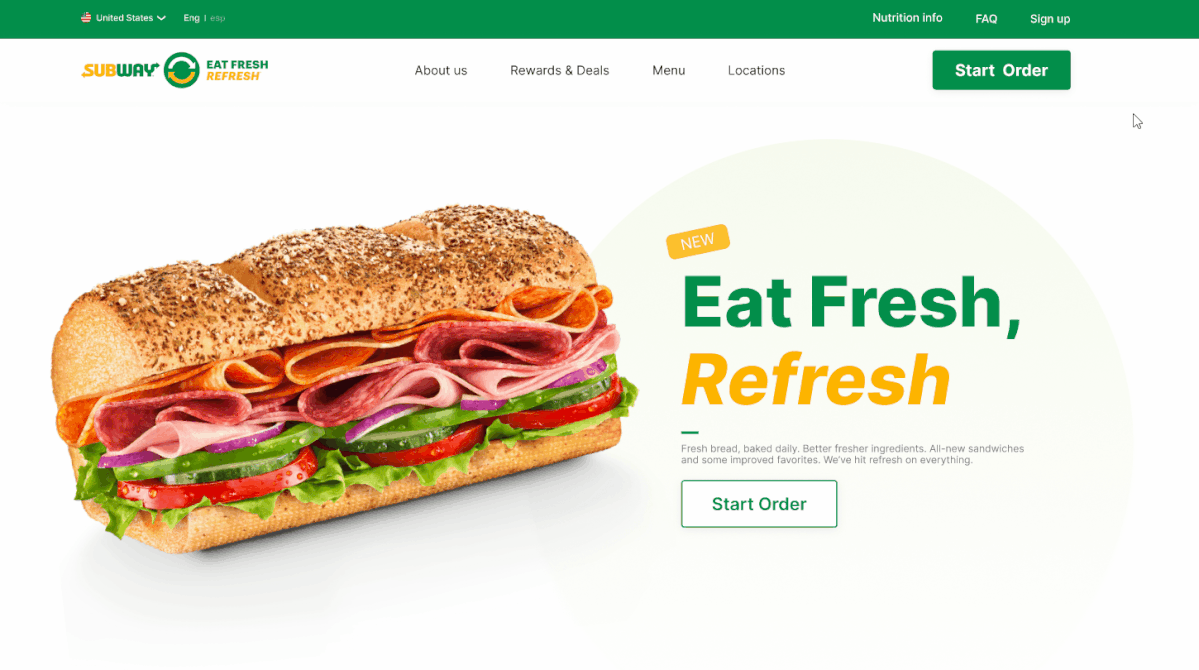
Considering the result of the survey, I put some functions that people want to quickly and easily access the most on the navigation bar and category.
② hero section
To let people know the new slogan and menu Subway has changed, I created this and wrote them with short description.
③ Menu
People are comfortable when directly looking at the menu and checking new menus on the landing page.
④ Promo code
Many people check the promo information before making a purchase and want to quickly use it which can be possible with Copy button.
⑤ brand values
People care about brand image and values when buying goods. By letting them know what Subway’s commitment is, they can know what effort Subway put on to make better products which can help people decide what products to buy.
⑥ social media
Several get many information through social media and can easily check what’s new which help them more interested in the brand.
⑦ app download & newsletter
Since Subway has newly changed, it is advisable to let people know and encourage them to use the app and subscribe newsletter.
Accomplishment
83.4%
Positive Feedback
10 out of 12 agreed that it looks: fresh, clean, healthy living, environmentally friendly according to a five-second test with casual food users.
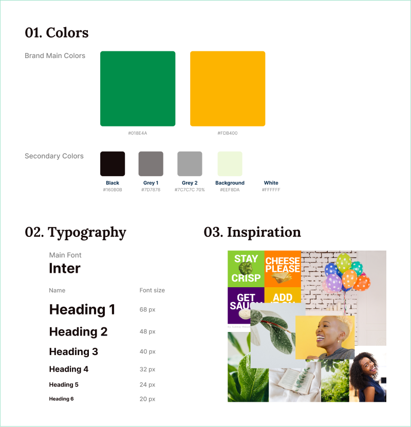
style guide
What I learned
Maintaining brand identity
Designing the brand website is not all about making it look pretty, but expressing brand identity and making an impression in a suitable manner. While redesigning the website, I had to make sure I was not diluting its existing brand identity.
Responsive design
To make multiple responsive devices, it took some time to design the proper layouts and orders. Besides, I had to add or get rid of some functions depending on the device’s use due to the limited layout space. I learned that good designs can help people to easily understand a product and for developers to work productively too.
Next steps
usability testing
I want to conduct the usability testing to find other opportunities and improvements for better usability for users next time.
Detailed page
It would be good to empathize more about Subway and users when I make detailed page for the brand. That way, I can understand them more and design it through users’ behaviors and flow and deal with more complex designs to learn and improve my UX skills.